


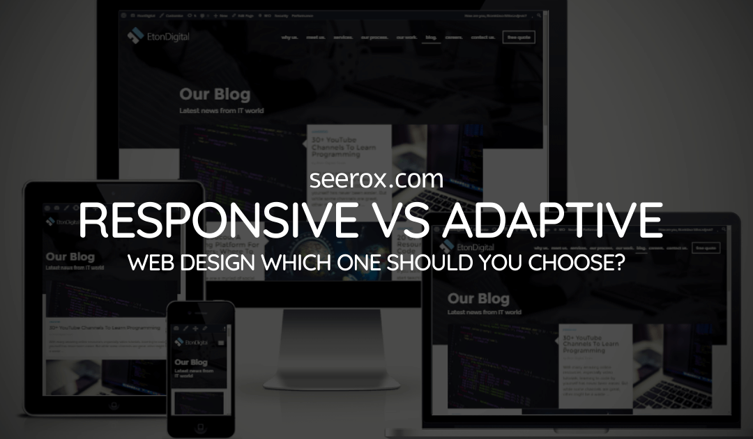
There are 2 ways web designers build websites so that they work with various screen sizes and devices: adaptive web design and responsive web design.
Responsive Web Design
Responsive web design is a method used to make websites that can change and adapt to different screen sizes. It uses special techniques like fluid grids and flexible images, along with CSS media queries, to make sure the website looks good on any device.With responsive design, the website’s elements are rearranged and resized to fit perfectly on screens of all sizes, from desktops to smartphones.
For example, if you make your browser window smaller on a website that adjusts to different screen sizes, you’ll see parts of the page move around or change size to fit the space. This ability to adapt is what makes a website responsive.

Benefits of Responsive Web Design
-
Seamless User Experience
Responsive websites provide a consistent user experience across different devices. Visitors can easily navigate through your website, regardless of the device they are using, enhancing user engagement and satisfaction.
-
Cost-Effectiveness
With a responsive design, you only need to maintain and update one website, as it adapts to different devices automatically. This saves both time and money compared to developing multiple versions for different screen sizes.
-
Search Engine Optimization (SEO) Friendly
Search engines, such as Google, prefer responsive websites because they have a single URL and HTML code. This simplifies the process of search engines crawling, indexing, and ranking your website, which ultimately boosts its visibility in search results.
Adaptive Web Design
In adaptive design, each device’s screen gets a unique website layout, tailored to its size. As the site loads, it detects the screen size and delivers the corresponding layout. There are six common screen sizes, ranging from small to large (320px, 480px, 760px, 960px, 1200px, and 1600px), and you can create different user experiences for each. To save time, you can refer to user analytics and focus on the screen sizes used most by your audience. For example, if Apple and Samsung Galaxy mobile phones are popular among users, you would design specifically for those screen sizes, rather than all six.

Benefits of Adaptive Web Design
-
Customized User Experience:
By designing unique layouts for each device, adaptive design ensures an optimized experience tailored to specific screen sizes and capabilities. This approach focuses on delivering only the most relevant features and visuals to each user, improving satisfaction and usability.
-
Performance Optimization:
Adaptive websites can be optimized for specific devices, resulting in faster loading times and improved performance. By removing unnecessary elements and optimizing images and scripts, adaptive design can deliver a faster and more efficient user experience.
-
Device-Specific Features:
Adaptive design allows you to leverage device-specific features, such as GPS, accelerometers, and touch gestures, to enhance the user experience. By utilizing these features, you can create unique and engaging interactions that are tailored to each device.
Key Take-aways
Now that you have a basic understanding of both responsive and adaptive design approaches, As you decide which approach will work best for your next UX project, remember that:
1. Responsive design adapts its layout and appearance based on the device’s screen size, while adaptive design creates different layouts for each device.
2. Responsive design requires collaboration between UX designers and developers to ensure usability across various screen sizes.
3. Adaptive design involves creating up to six versions of a website for different-sized screens, allowing for optimized user experiences.
4. Responsive design is well-suited for larger sites starting from scratch, while adaptive design is beneficial for smaller sites undergoing updates.
Challenges of Each Approach
No solution is perfect, and it’s important to understand the potential challenges:
Challenges of Responsive Design
- Performance Issues: On smaller devices, responsive sites might still load large images or unnecessary resources, affecting performance.
- Design Constraints: Ensuring the design looks great on all screen sizes can be challenging.
Challenges of Adaptive Design
- Higher Development Costs: Creating multiple layouts requires more time and resources.
- Limited Flexibility: Adaptive sites may not work well on devices that don’t match predefined breakpoints.

So whether you’ve chosen to use responsive web design or adaptive, don’t just focus on how to reposition, resize or represent your content on different platforms. Also think about how the context affects content interaction. At Seerox, we understand the importance of creating user-friendly websites that provide optimal experiences across all devices. Our expert team of web developers can help you choose the right approach and implement it seamlessly to ensure your website engages users and drives success in today’s mobile-driven world.